With growing awareness around sugar intake and health, consumers were seeking lower-calorie beverage options. While soft drink giants offered zero-calorie alternatives with artificial additives, iced tea — anaturally lighter, fruity option — remained underserved. POKKA wanted to create a zero-sugar iced tea that felt authentic, pleasurable, and in line with the brand’s fun, approachable personality.
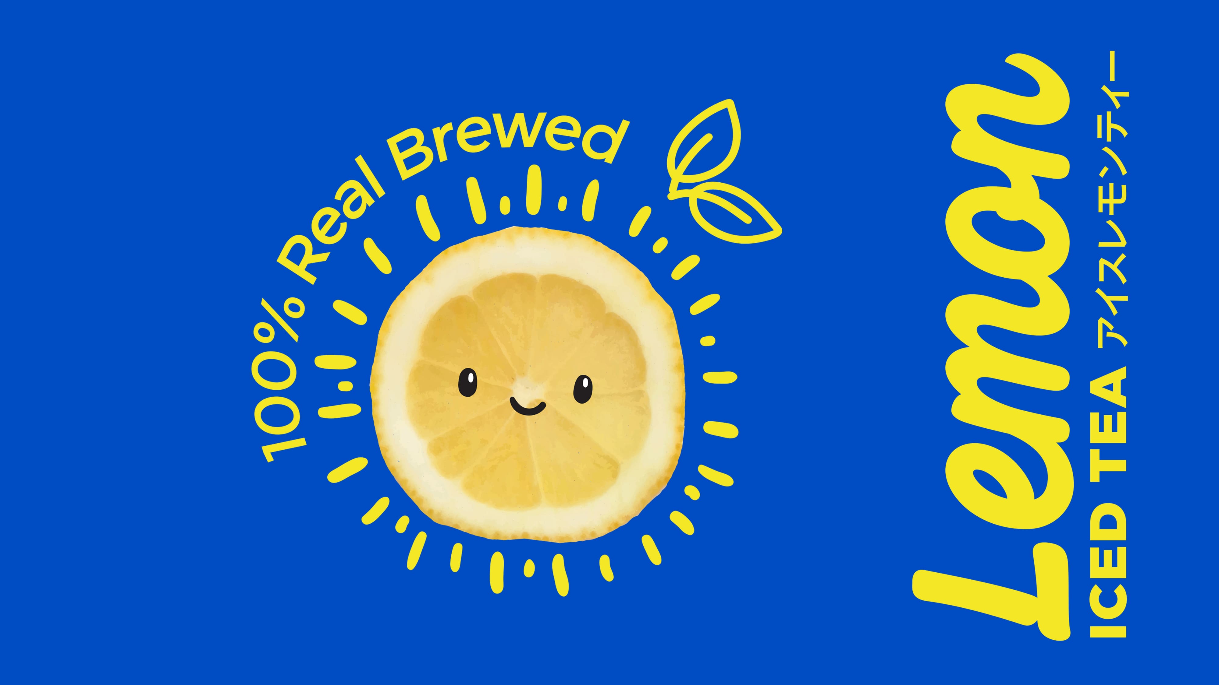
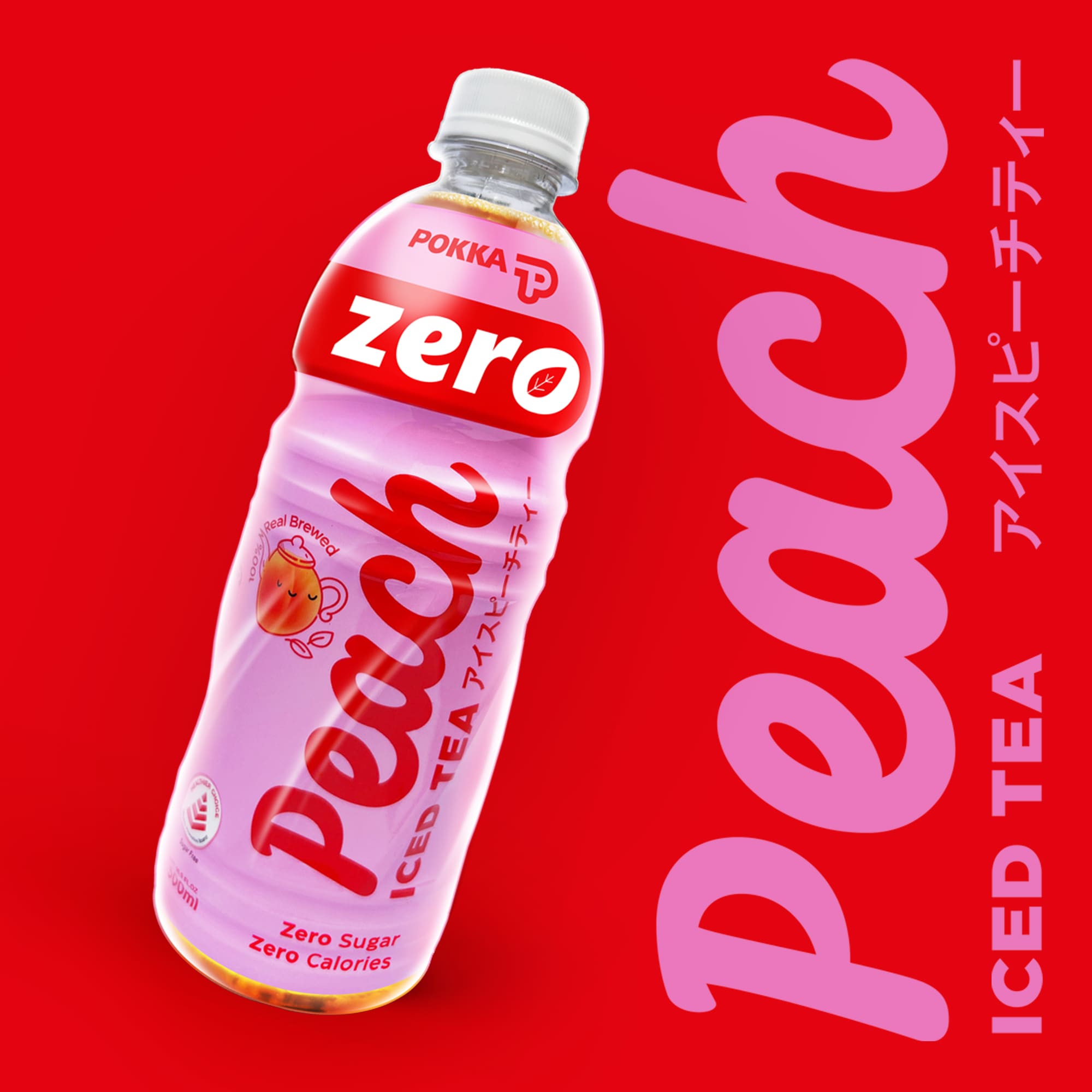
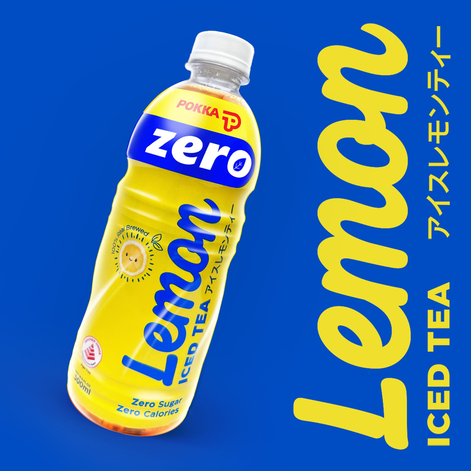
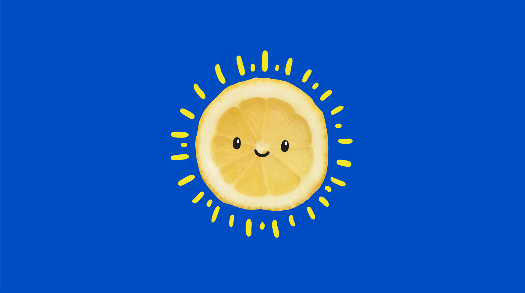
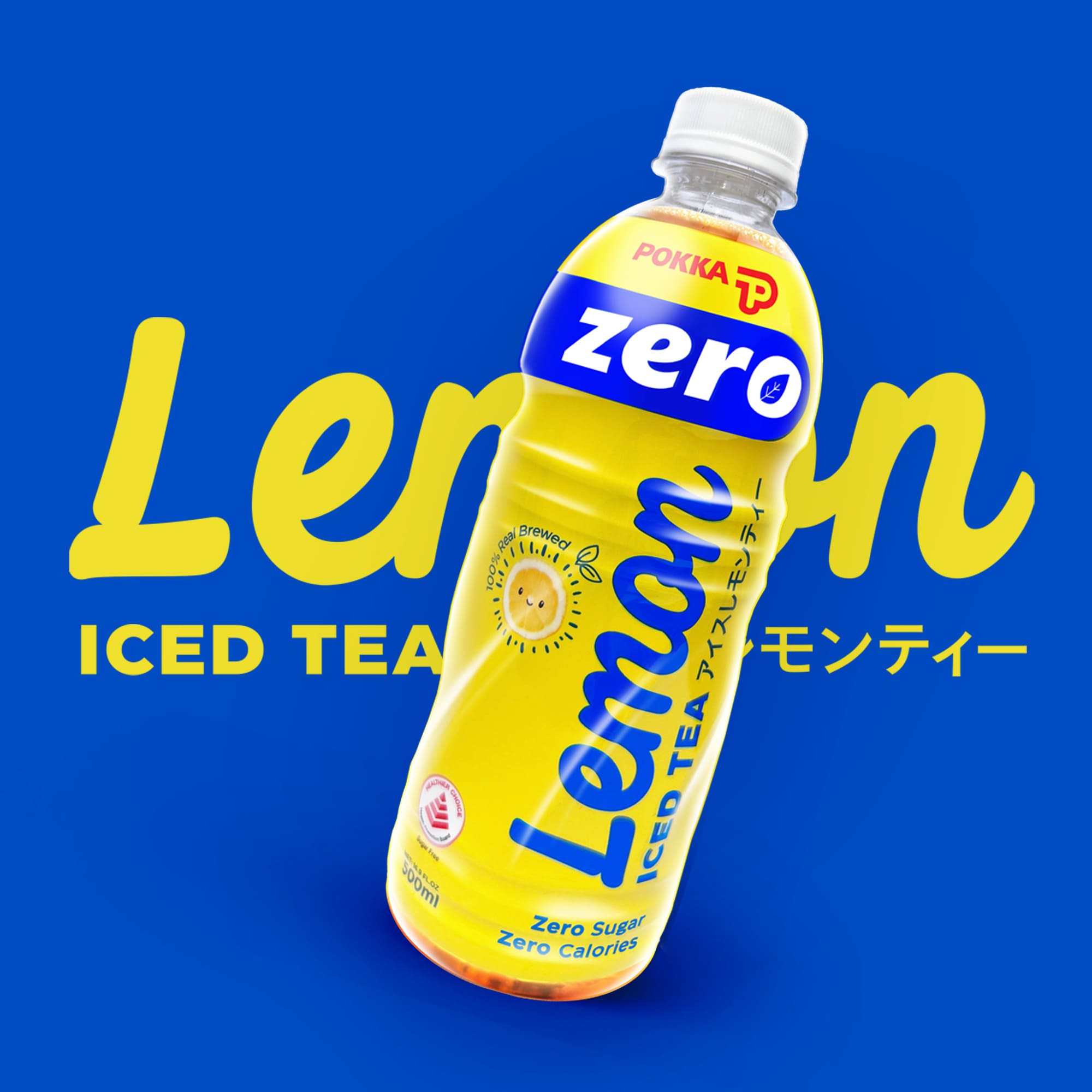
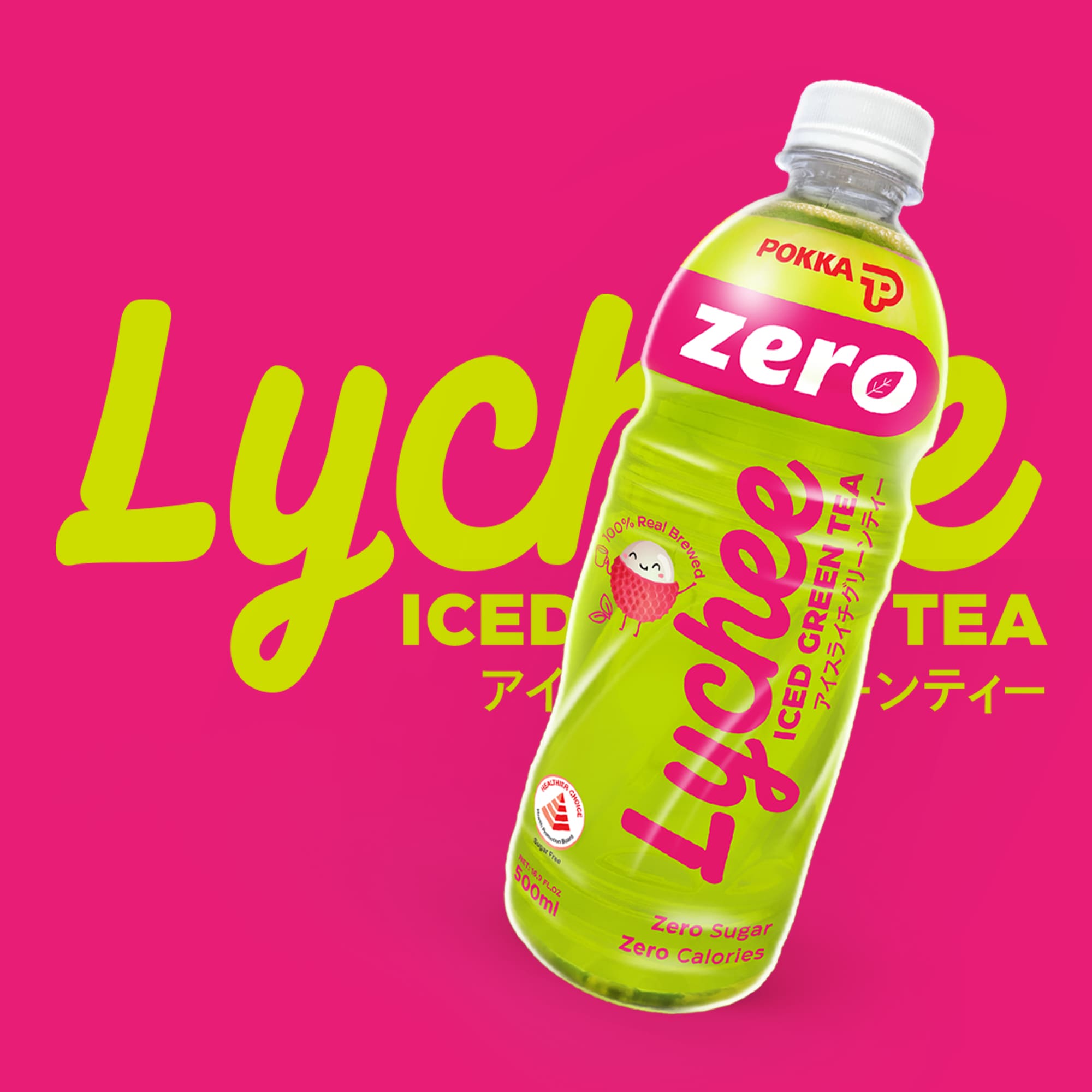
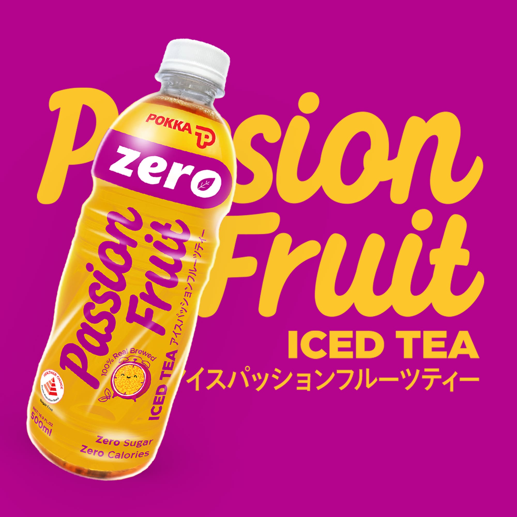
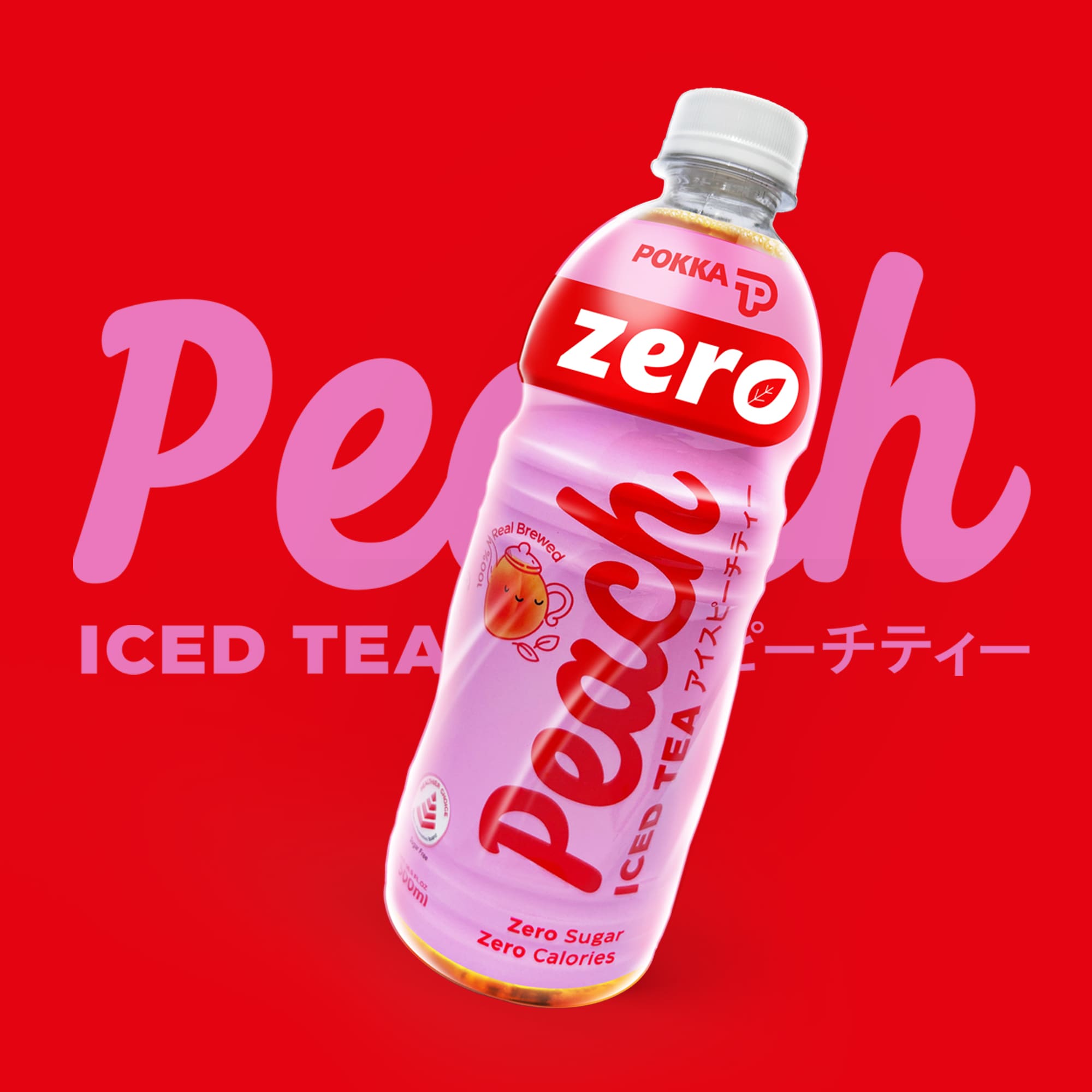
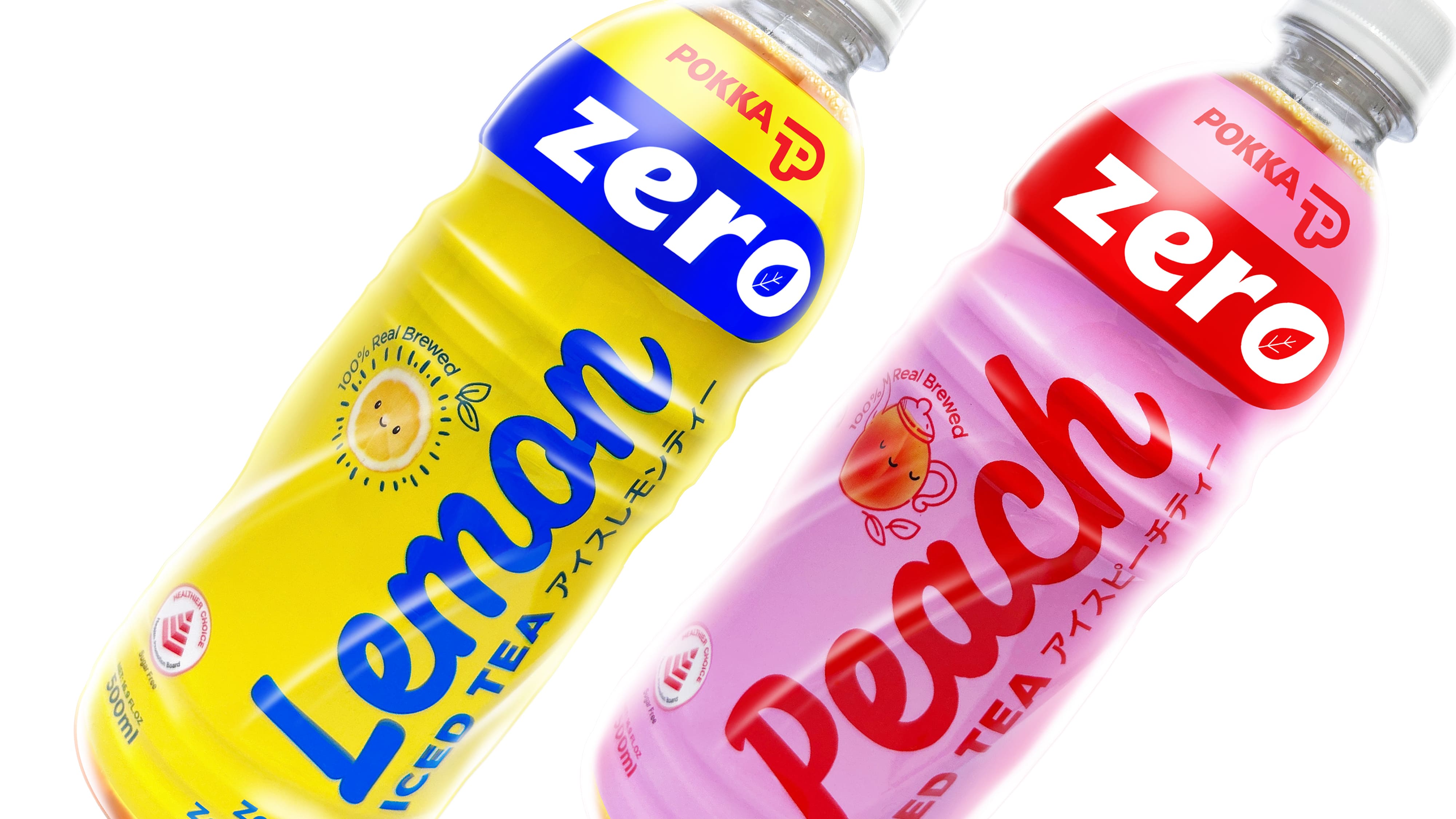
We challenged typical zero-calorie design conventions, which often relied on austere silver or black palettes. These visual cues felt sporty and detached, failing to convey the enjoyment and refreshment inherent in POKKA’s fruity teas. Our solution was to create a vibrant sub-brand identity: bright, flat, two-colour wraps that immediately signalled “zero” while remaining playful and visually engaging. Charming, stylized illustrations replaced literal fruit imagery, adding personality and delight to the packs.
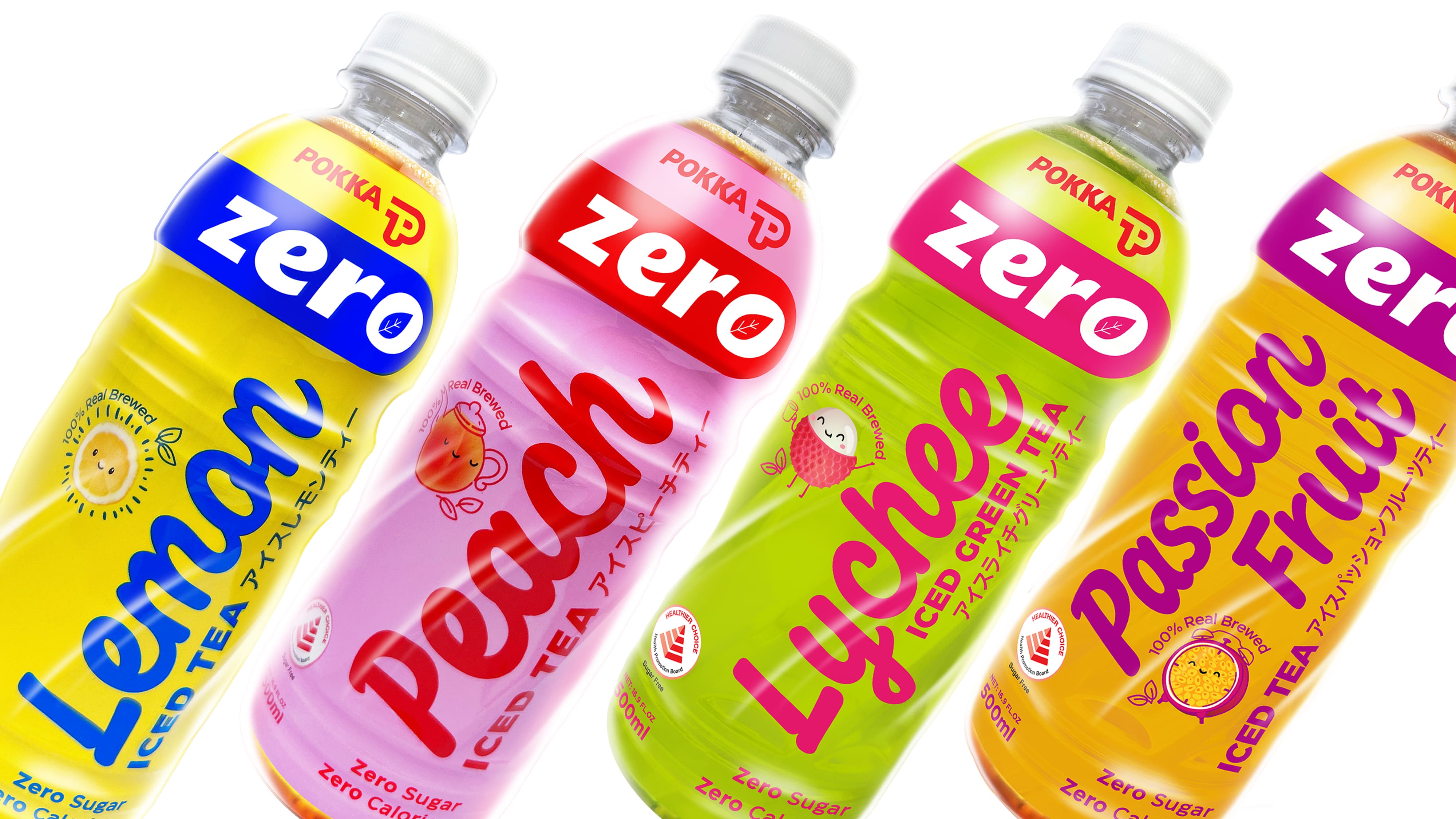
The new design struck a balance between clarity and brand alignment, positioning POKKA Zero as youthful, approachable, and “Instagrammable.” By translating the idea of zero calories into a visually fun, distinctive identity, the refreshed packaging captured attention on-shelf, resonated with health-conscious consumers, and reinforced POKKA’s commitment to enjoyable, modern, and authentic iced tea experiences without compromise.